

This article will continue on the topic discussed in Part 1, be sure to check it out!
Display

The max and min temperature limits can be assigned to a sensor using the Parameter Thresholds function on both the app and the web platform of SmartRock Web. When assigned, these limits are represented in the form of fine lines in red (max limit) and blue (min limit) color.
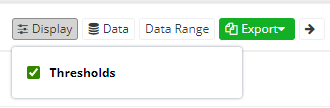
Using the 360 dashboard, a user can choose if they would like to have the threshold limits displayed on the chart or not by using the ‘Display’ feature. The final PDF reports will reflect these changes accordingly.
Data Selection
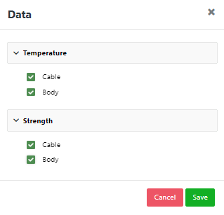
For the purpose of report generation, a user might have several preferences, one of them being how the data is able to be displayed. The charts can display cable temperature, body temperature, cable strength, and body strength data. Should there be the desire to only focus only on a specific data set i.e., to filter the chart by selecting cable temperature, and cable strength only and completely neglecting the body data. In such cases the ‘Data’ feature can be utilized to select appropriately as illustrated in the image below.
Data Range
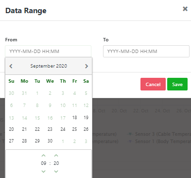
Amid the care and attention adopted, there are instances when the user might want to filter date and time on a chart due to reasons such as excess data recorded after the target time, data collected prior to placement, time adjustments, and more predominantly the goal for daily reports. On such occasions, the ‘Data Range’ feature would allow for the customization of graphs where the final PDF reports and charts can be specifically generated at ease.
Expanded Chart View
There are instances when chart and data size can be tuned directly to the needs of the user, thus ensuring a more effective display of data. A clear and larger chart view would be the most effective in certain situations, and exactly for this reason, SmartRock Web has an “Expand” option. Using this feature, the chart will become larger, and the data points will be evenly scattered over the curve serving the goal of better understanding and exposition.
Sensor Selection
The quantity of sensors able to be used per jobsite is solely up to the client and the updates to SmartRock Web reflect the needs of clients to use multiple sensors per project. Each section of the SmartRock Web program contains a given number of sensors that can be displayed in a single combined chart. For reporting purposes on SmartRock Web a user has the capability to select and customize the number of sensors to be displayed in a chart and export it accordingly in various formats.
This facilitates the achievement of visual representation of combining integrated data for a ‘n’ number of sensors. As a result, the user can visually interpret the data efficiently and find the comparison view of how the data monitored by the sensors transitions and differs from each other.
Maturity Charts
Apart from the temperature and the strength charts in their own tabs, the ability to display maturity charts are available in a tab of their own.
This chart contains the maturity index value that was obtained through the calibration exercise as per ASTM C1074. The data information tab will display the maturity index value as well as the cable and body maturity regarding temperature, strength, and time relation. The pouring values at individual times are also recorded and available for inspection. The sensor selection is applicable to maturity charts as well allowing the end-user to have the flexibility to view individual or combined data.
The maturity charts can also be exported in different formats. Being able to view the maturity data in a separate chart increases the data’s clarity and comprehension from a user’s perspective. Ultimately, this chart is the perfect depiction of maturity value with its relationship with temperature, strength, and time.
With that all being covered, as mentioned, now you can see that SmartRock Web is indeed a ‘One-place solution’ for all. But is that all?
– Absolutely not!
The SmartRock Web program is a web-based dashboard that is the next level in data analytics, reporting, and user management capabilities for the SmartRock sensors. The program is ever updated and improving to meet the needs and requests of workers, these updates to the graphing aspect of the program are instrumental in making the most out of the SmartRock sensor. All aspects of a customer’s feedback provided is noted, immediately assisted with, and escalated to different departments if needed. These recent changes to SmartRock Web are designed to reduce risk, cost, and time of work and are available upon the purchase of a SmartRock sensor. Through the SmartRock sensors and SmartRock Web program updates workers can graph variables that would ensure an effective project, direct focus, and personalize the graphs directly to their needs.